
Bluescape touch screen clients
The Bluescape touch screen clients brought visual collaboration to wall-scale. 74 to 104-inch monitors, mounted in conference rooms, classrooms, situational awareness centres, and production suites. Configured as single displays or arrayed 2×2 and 3×3. Designing for that context meant rethinking interaction design from first principles. It produced one patented interaction along the way.
The Challenge
Scale changes everything in interface design. A toolbar at the top of a standard monitor is always within reach. On a 104-inch wall display, that same toolbar is physically unreachable for many users. Hit zones sized for a cursor are too small for a fingertip. Presentation mode means clearing all the UI chrome; users still need a way to get it back, wherever they happen to be standing in the workspace.
The users were as varied as the environments: enterprise meeting attendees, room facilitators, teachers, post-production teams in the M&E industry, and analysts in government situational awareness rooms. Some were highly technical. Most just needed to collaborate. All of them were on their feet.
My Role
I led the interaction design for the touch screen clients, working closely with engineering to translate the interaction model into working software. This included defining touch-specific UI patterns, validating them against real hardware configurations, and driving the design of the Summon to Me interaction that was ultimately patented.
The Process
Touch-First UI Patterns
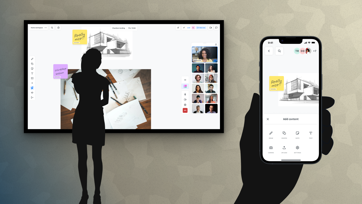
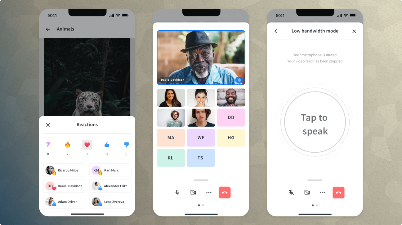
Everything had to be sized and positioned for fingers, not cursors. Hit zones expanded throughout the interface. Navigation was restructured for standing users who might be at arm's length from the display or further. Stylus input was supported for precision work, particularly relevant for M&E customers doing annotation and markup. External keyboards integrated naturally for text-heavy tasks, with on-screen keyboard available when needed.
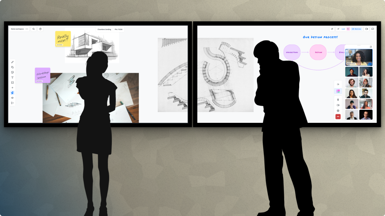
Reachability was the central constraint. On a 3×3 array of 86-inch monitors, the total display area is simply larger than a person can reach standing in one place. UI fixed at the edges of that canvas stops being useful for users working in the middle of it. The design had to account for human physicality in a way that desktop and web design never needs to.
Summon to Me
The Summon to Me interaction was our answer to the reachability problem. A long press anywhere on the workspace calls all the UI toolbars to gather around the user's fingertip, wherever they're standing, wherever they're pressing. This means a user can clear all the interface chrome and go into full presentation mode with the canvas, then summon everything back to exactly where they need it without walking to a corner of the screen. The interaction was designed, shipped, and eventually patented.
A/V Integration
The touch clients also incorporated a swappable A/V architecture that allowed organizations to bring their existing meeting solutions (Zoom, Teams, or whatever platform they were running) directly into the Bluescape interface. The design challenge was making that integration feel native: not a separate tool bolted on, but a natural part of the collaboration surface.
Outcomes
The touch clients were deployed across enterprise conference rooms, university classrooms, government situational awareness rooms, and production suites at major M&E companies. The Summon to Me patent stands as one of the most concrete outcomes of design work I've been part of: an interaction that started from a genuine user problem with no obvious solution.
Reflection
Designing for wall-scale forced me to think about human physicality in a way that screen design rarely does. The body matters. Where people stand, how far they can reach, whether they're tall or short. These are real constraints the interface has to work around. Summon to Me was the product of taking that constraint seriously rather than papering over it.
The core insight seems obvious once you've solved it: when the screen is bigger than your reach, the UI has to come to you. It wasn't obvious at the start. It came from spending real time with the hardware, watching people use it, and being willing to invent something that hadn't existed before.